Branding Spriggy
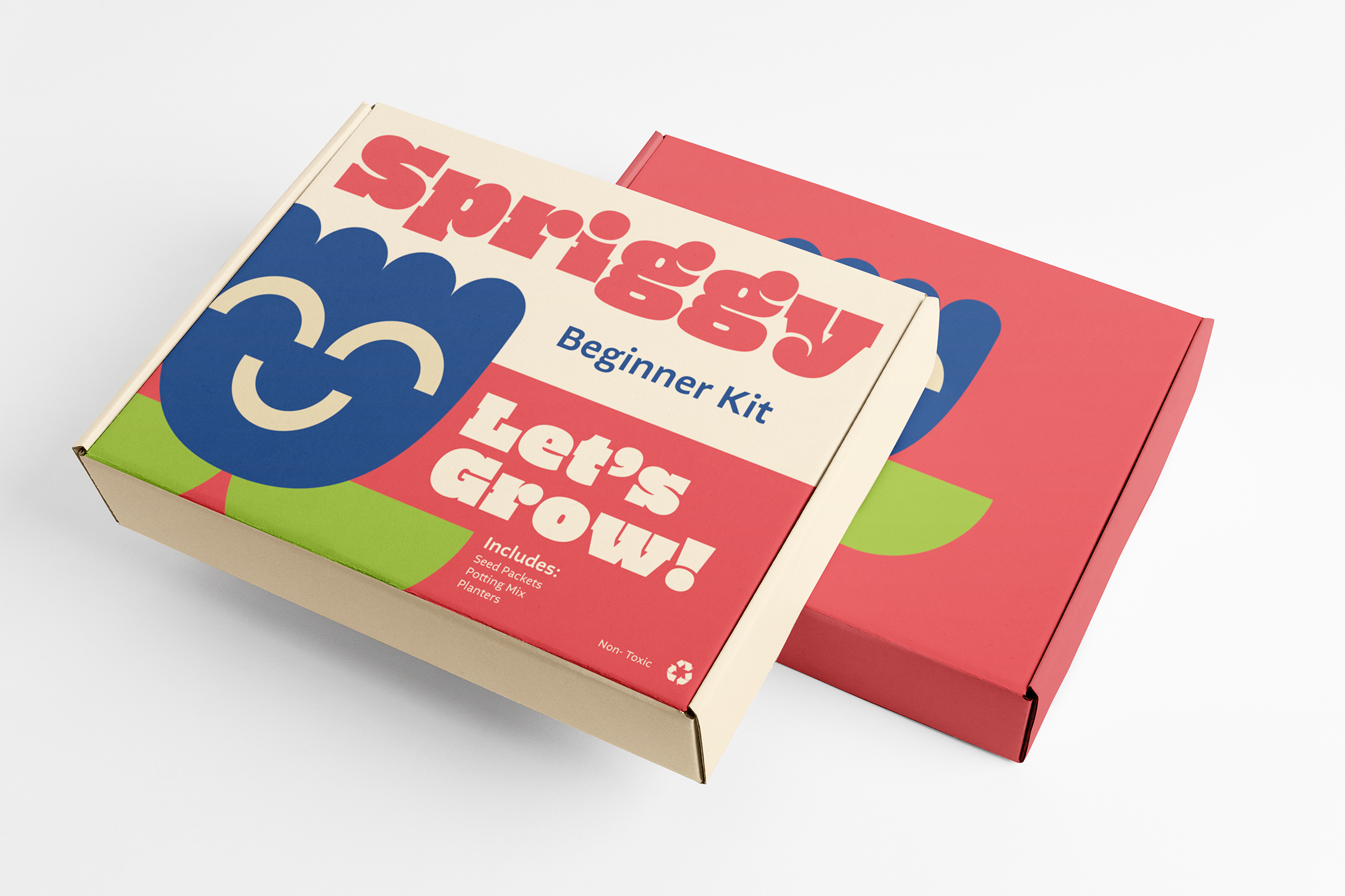
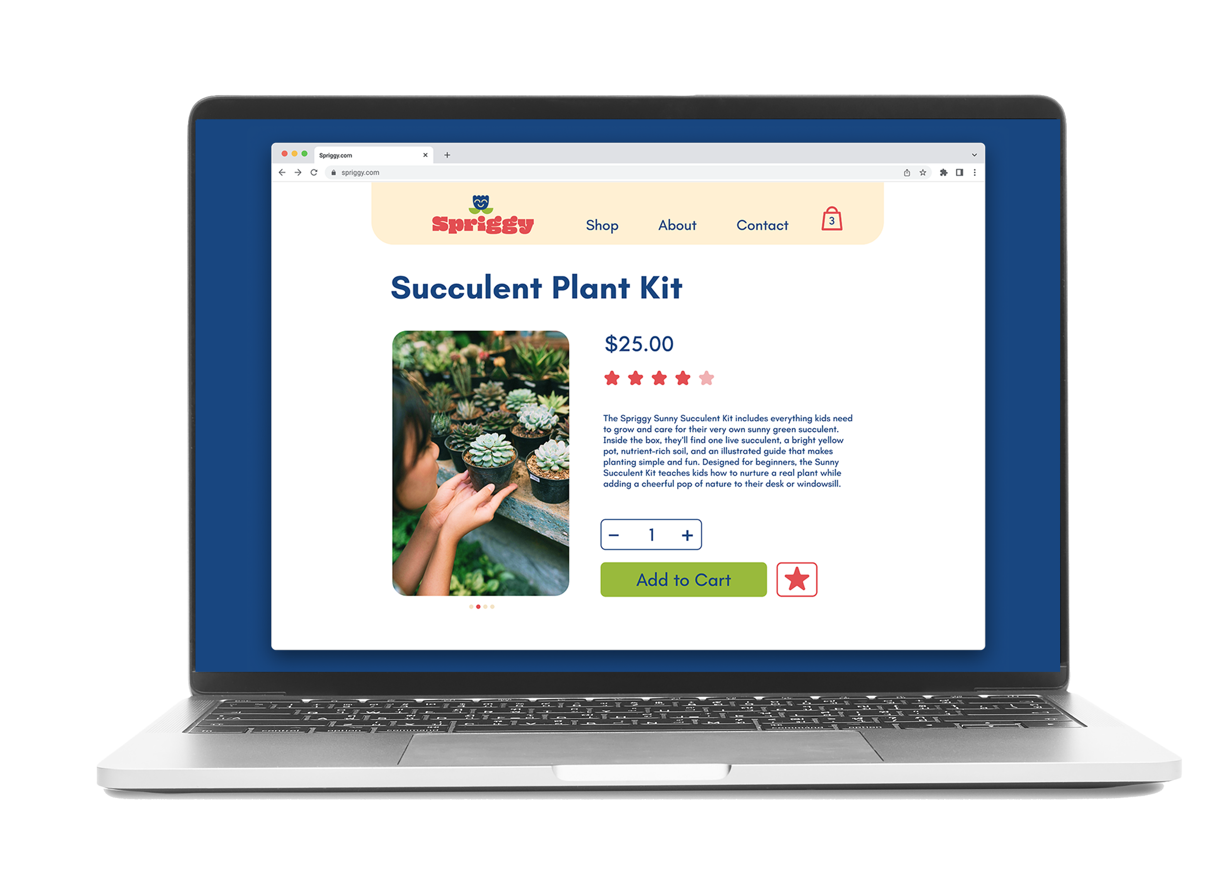
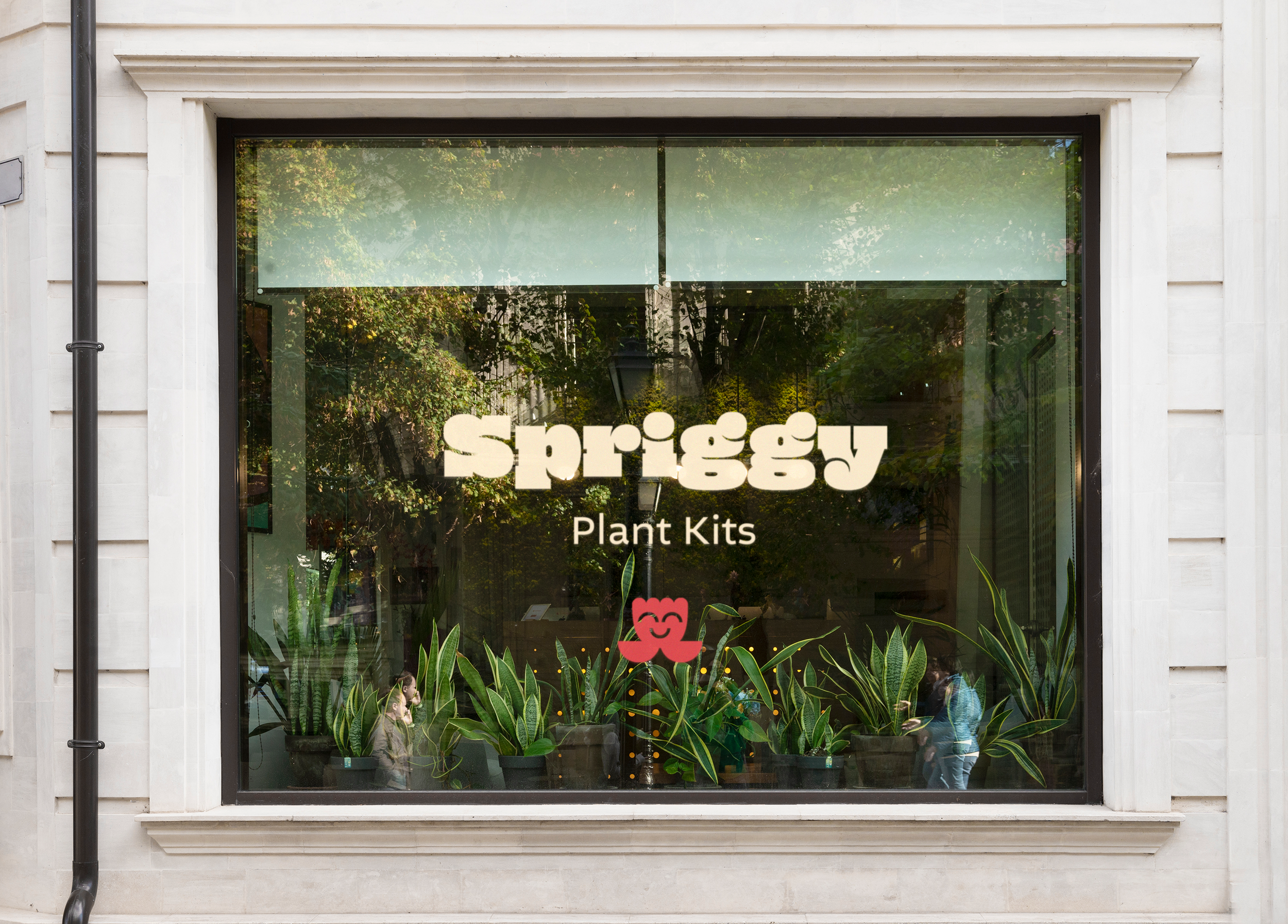
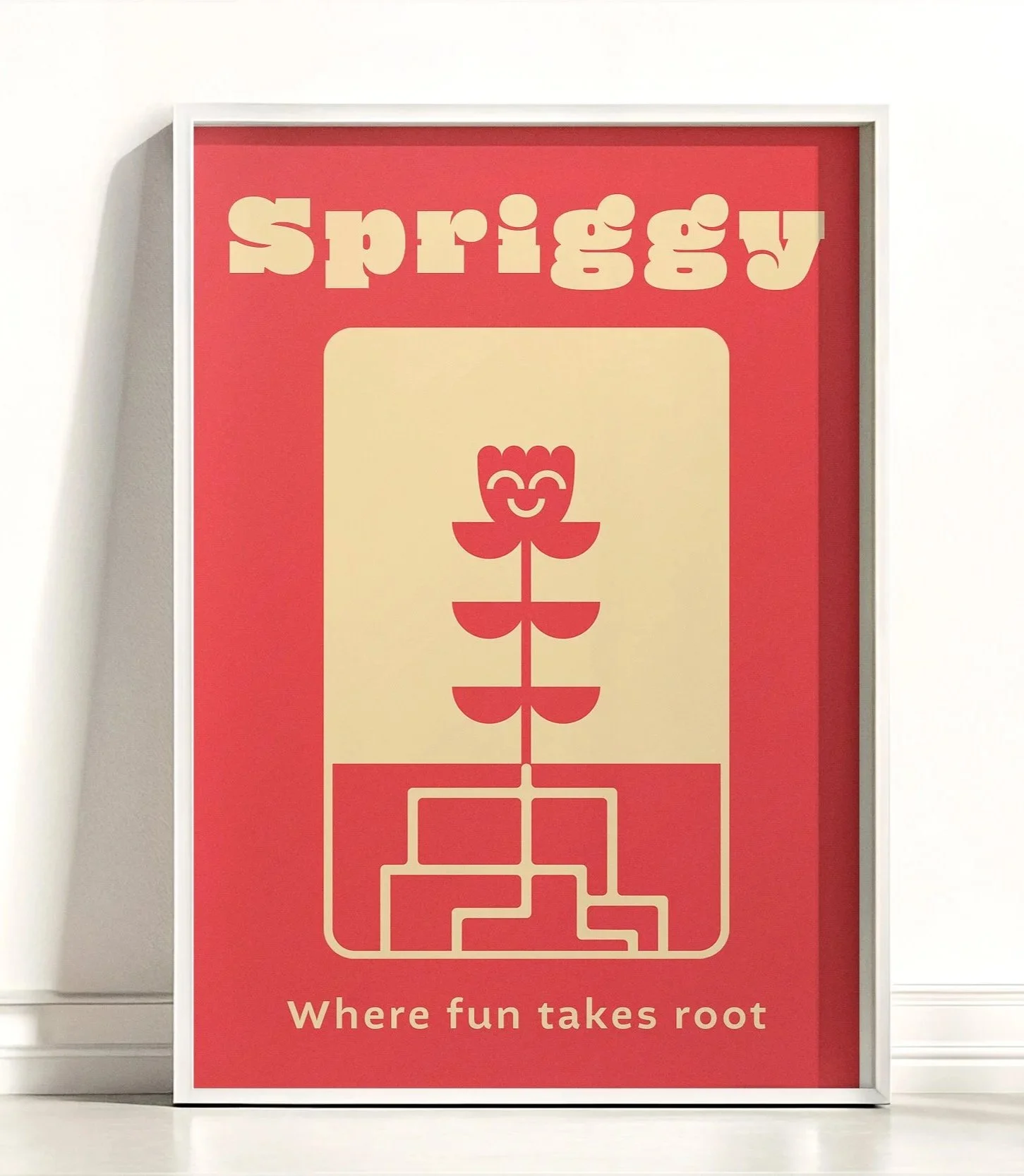
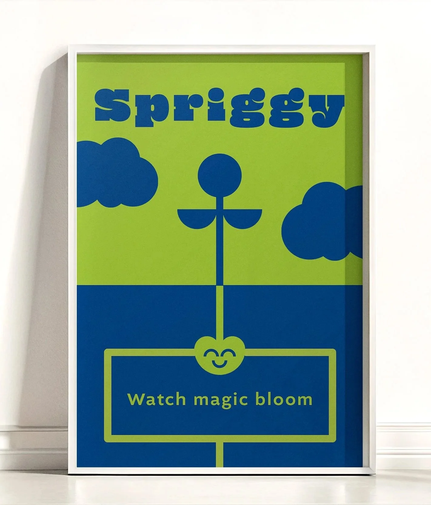
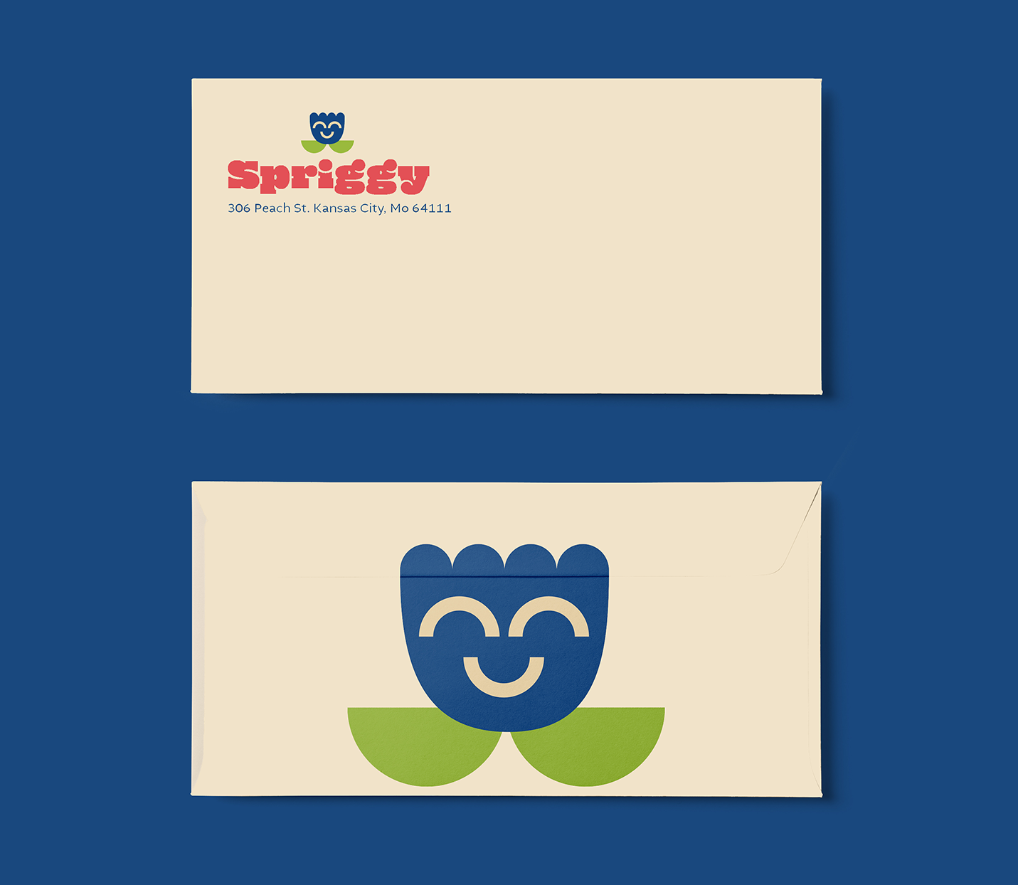
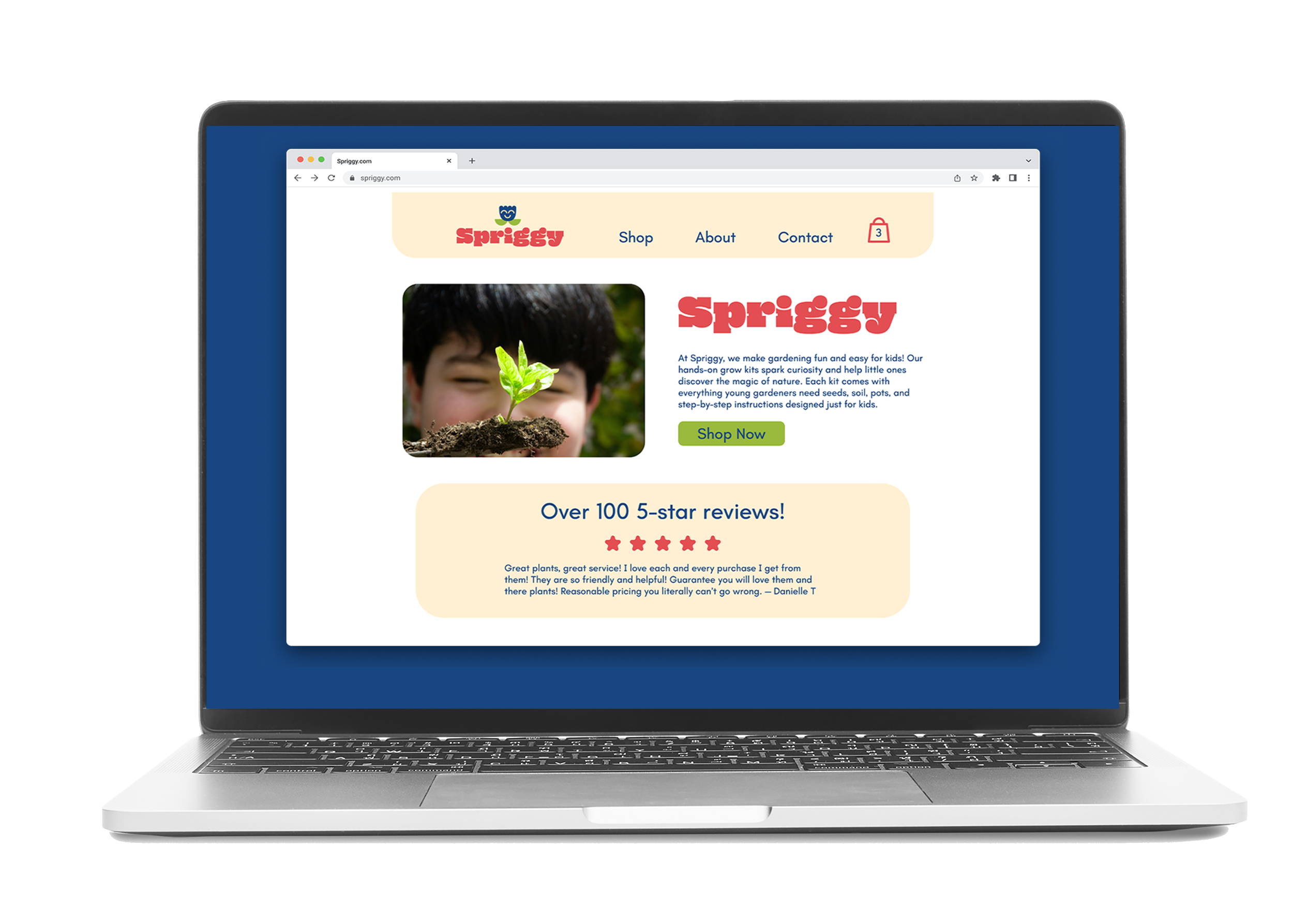
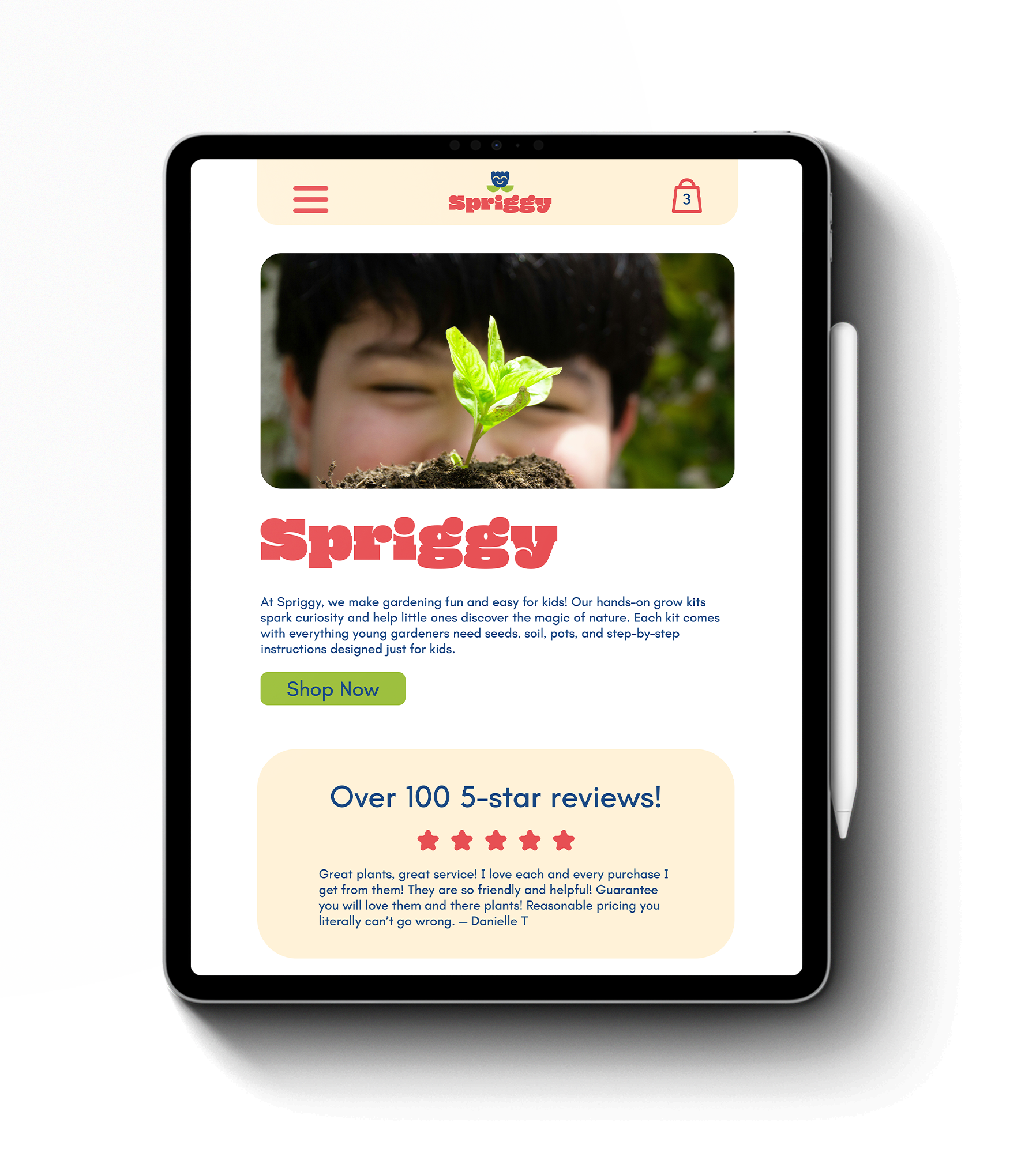
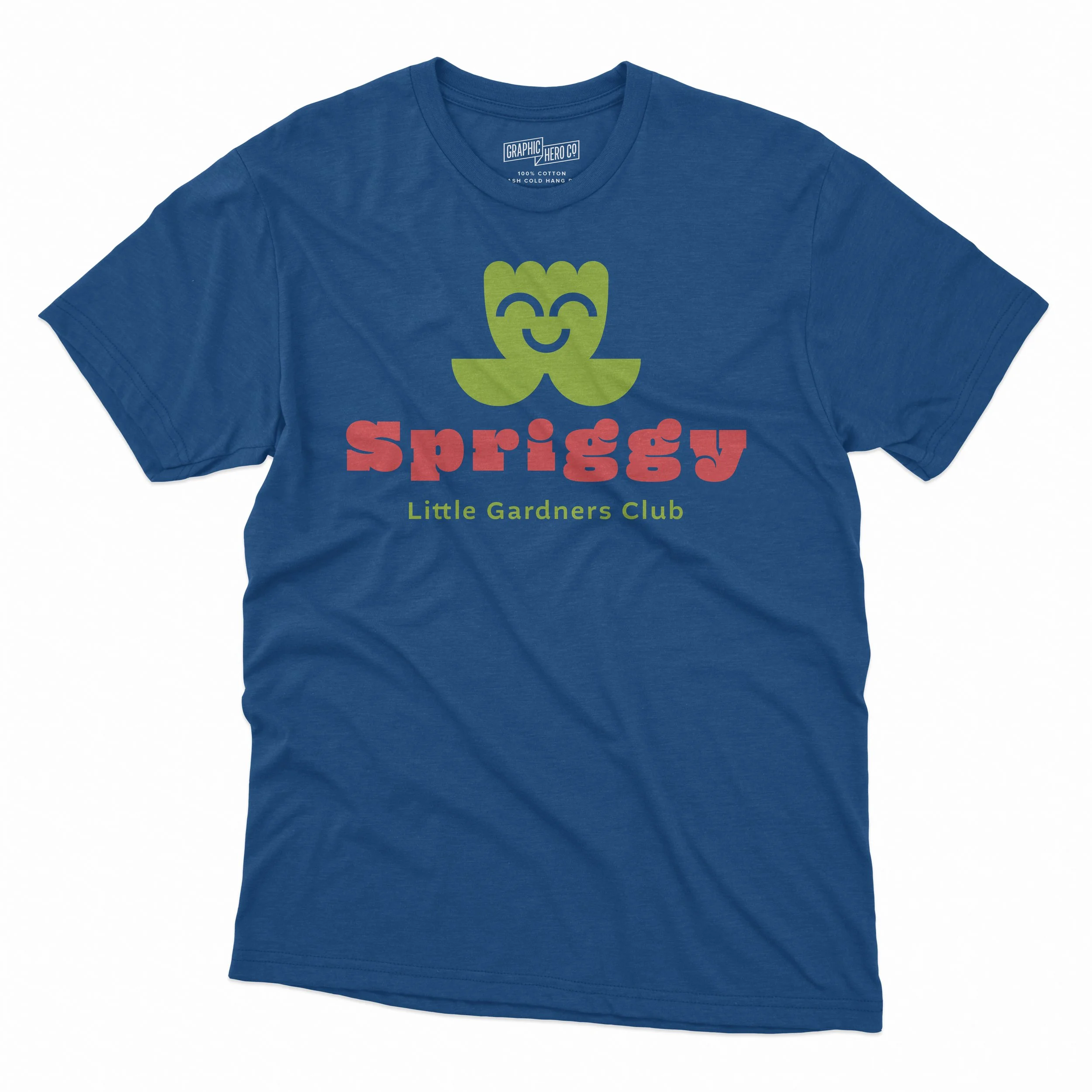
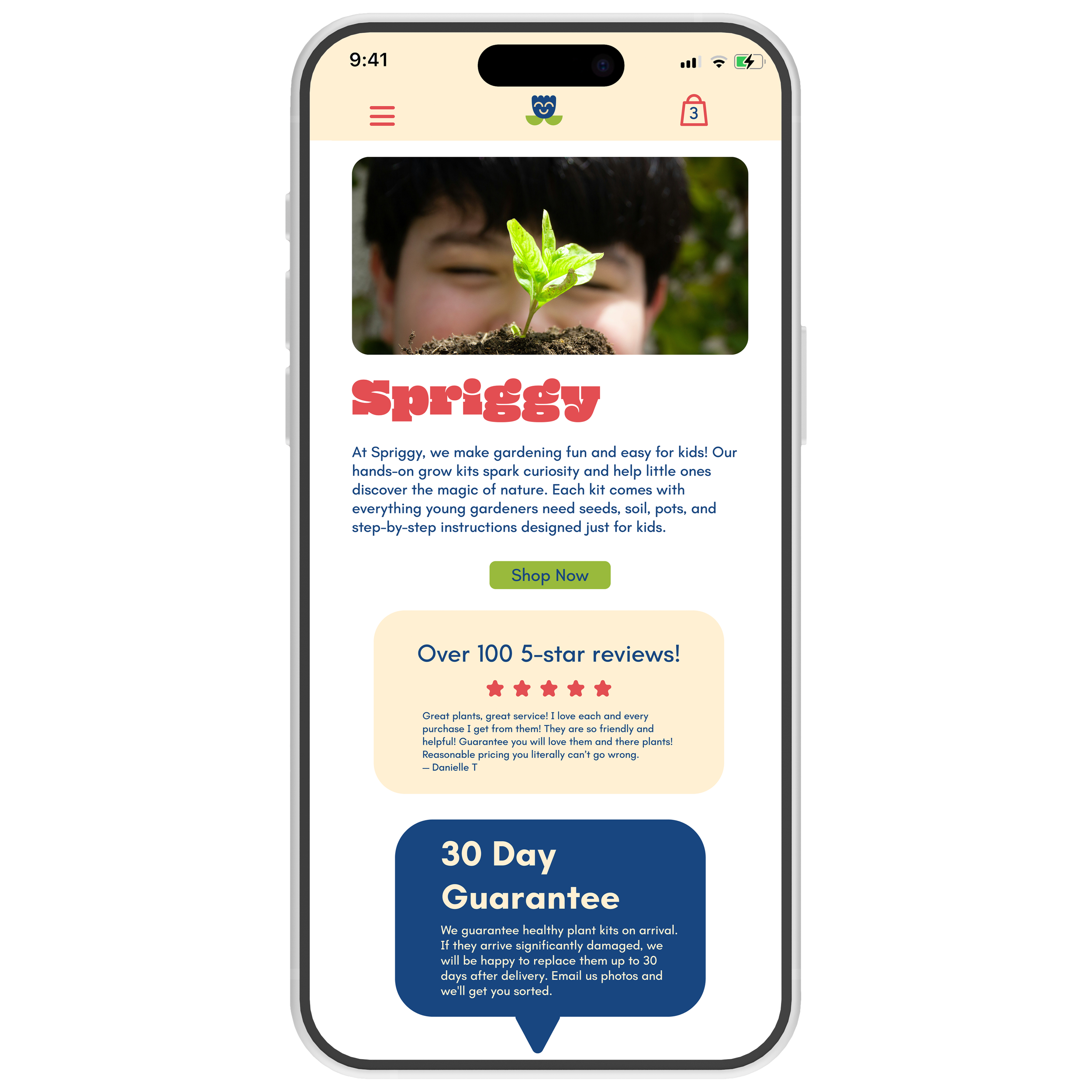
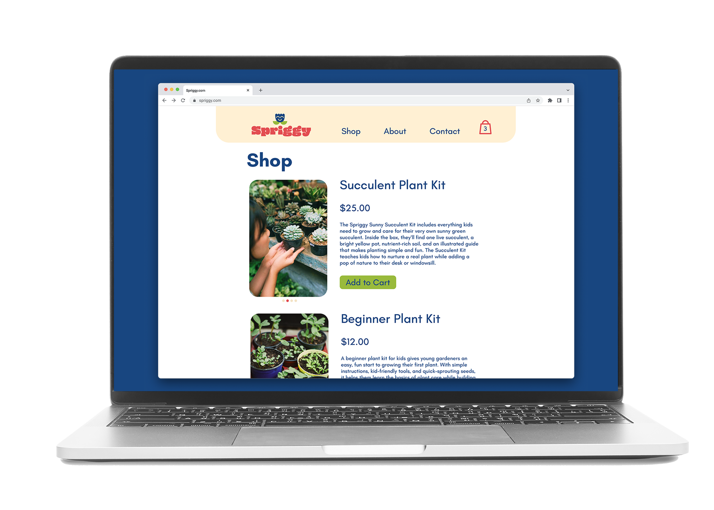
Branding Spriggy meant finding the balance between playful energy and approachable simplicity. The visual identity uses bright, cheerful colors and friendly illustrations to capture the excitement of growing something from scratch. At the same time, clean layouts, clear typography, and straightforward messaging keep the brand easy to understand for both kids and parents.


About Spriggy
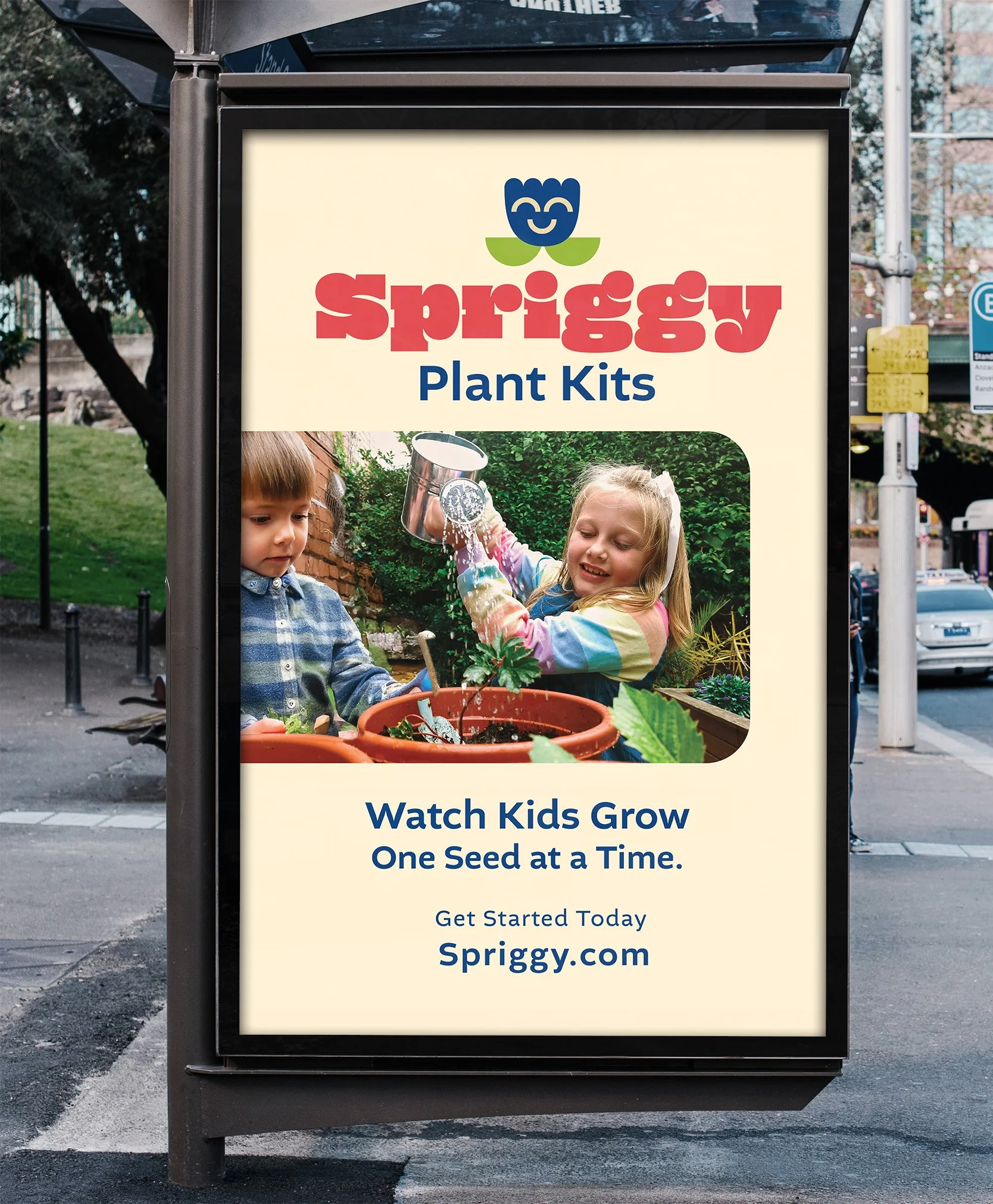
Spriggy is marketed towards children. An educational kit for indoor gardening. Every Spriggy kit comes with instructions for hands-on learning. Spriggy may be for kids but it is still pleasing to the eye and designed to look good in any parent’s home.
